What this report shows
Identify your best and worst performing products. Compare quantity sold vs revenue generated, and break down performance by source, fulfilment type, outlet, time of day, or tag.Sales numbers are based on main product price and may not account for bundling, discounts, or modifier price overrides.
Filters
- Product filters
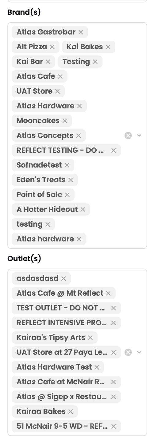
- Location filters
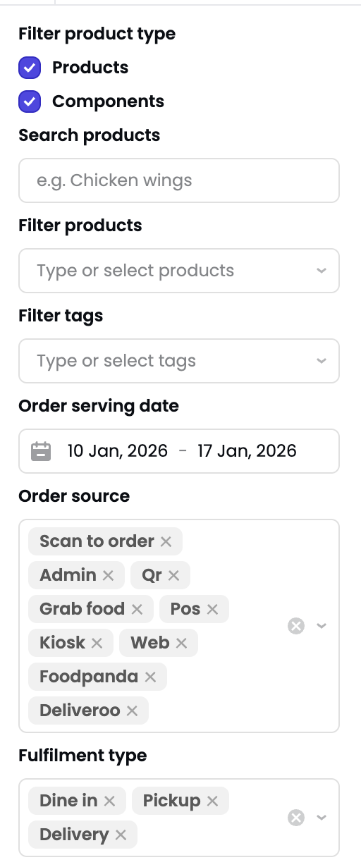
- Filter product type — Products, Components, or both.
- Search products — Free text search.
- Filter products — Select specific products.
- Filter tags — Filter by product tags.
- Order serving date — Date range.
- Order source — POS, Kiosk, Web, Grab Food, etc.
- Fulfilment type — Dine-in, Pickup, Delivery.
Sections
Top and bottom performers
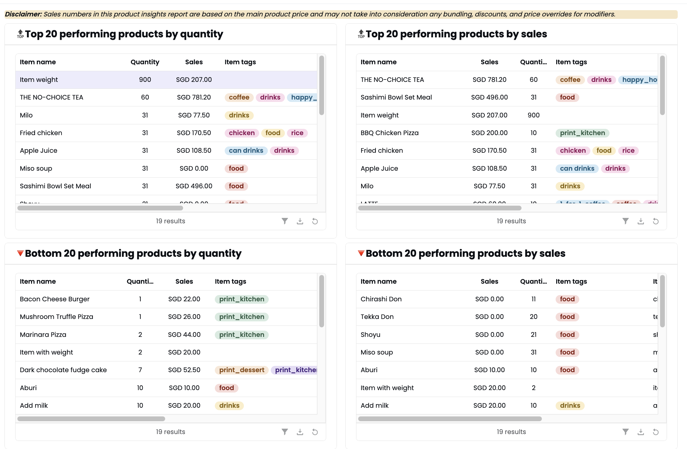
- Top 20 performing products by quantity — Most sold items.
- Top 20 performing products by sales — Highest revenue items.
- Bottom 20 performing products by quantity — Least sold items.
- Bottom 20 performing products by sales — Lowest revenue items.
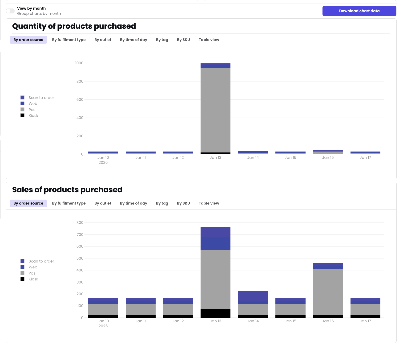
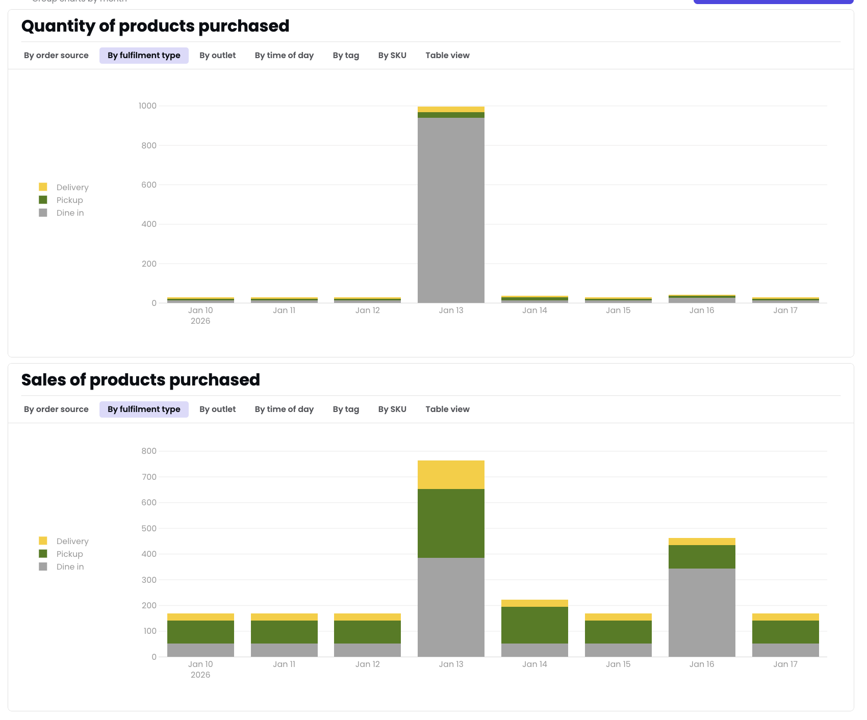
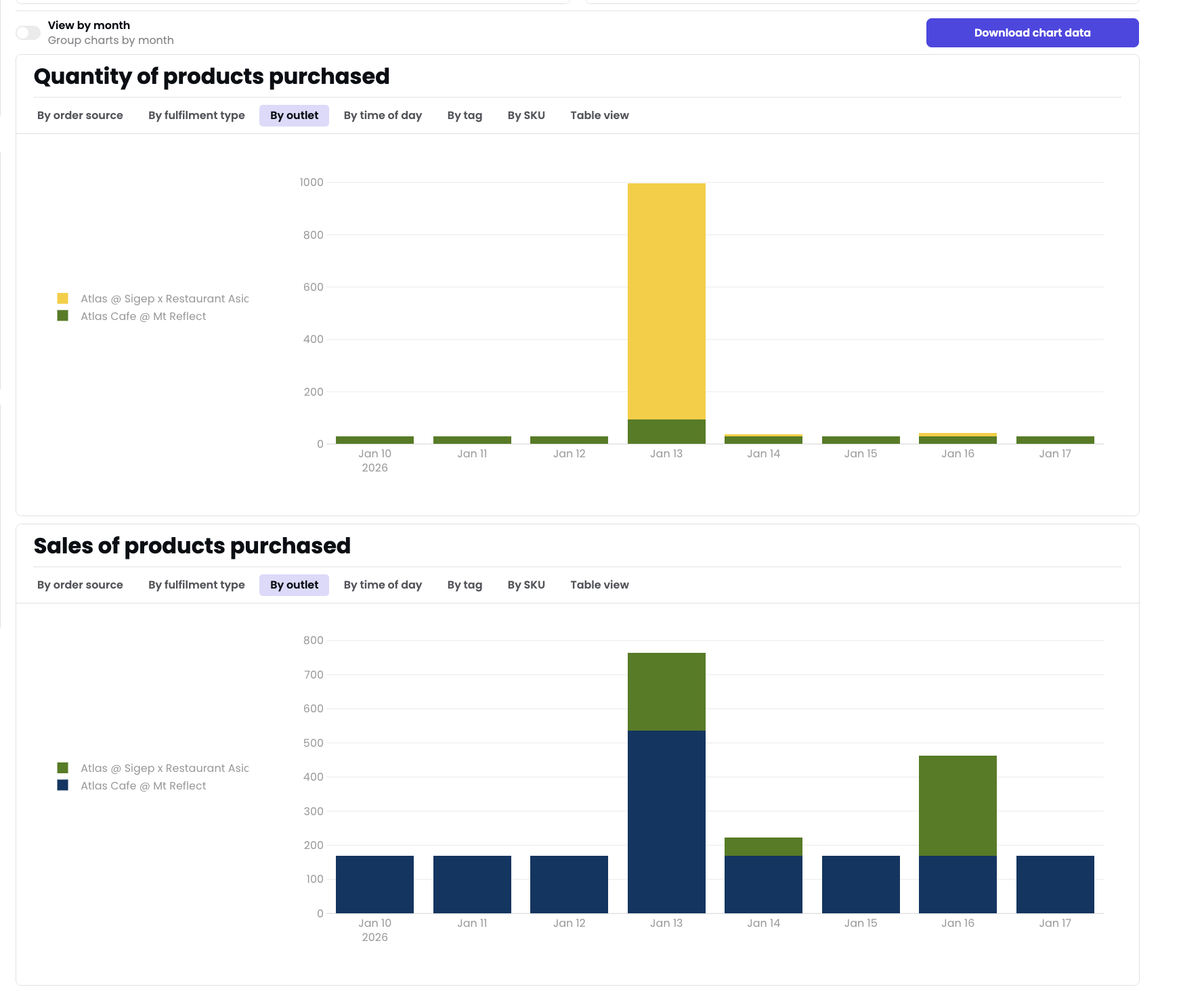
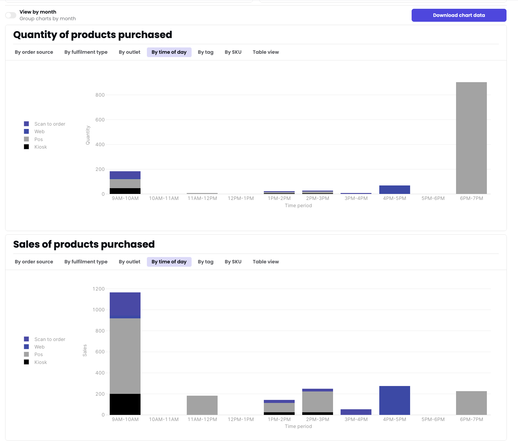
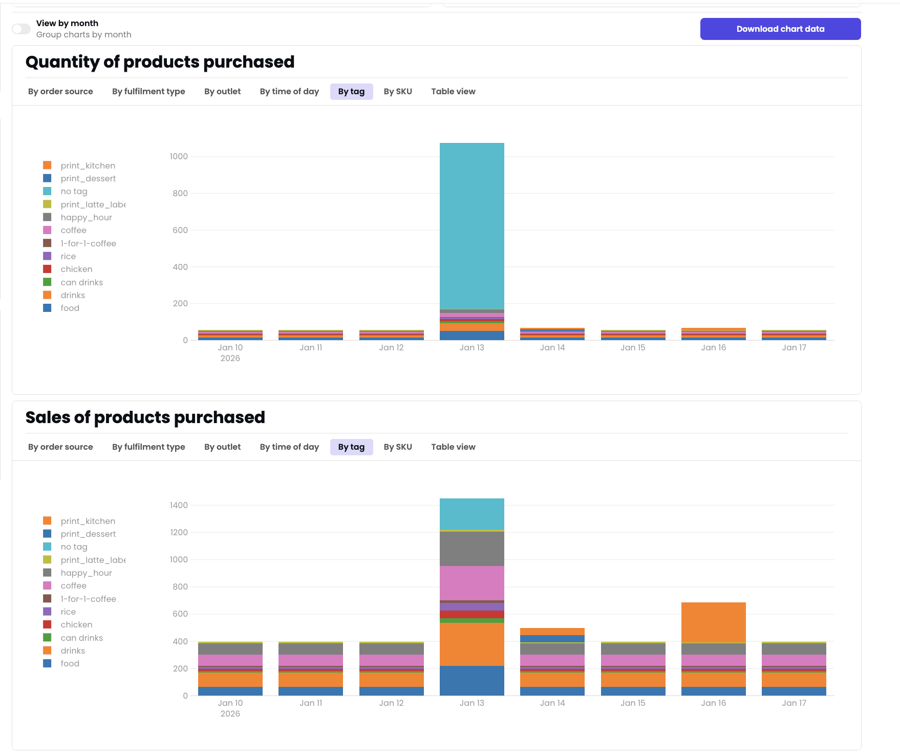
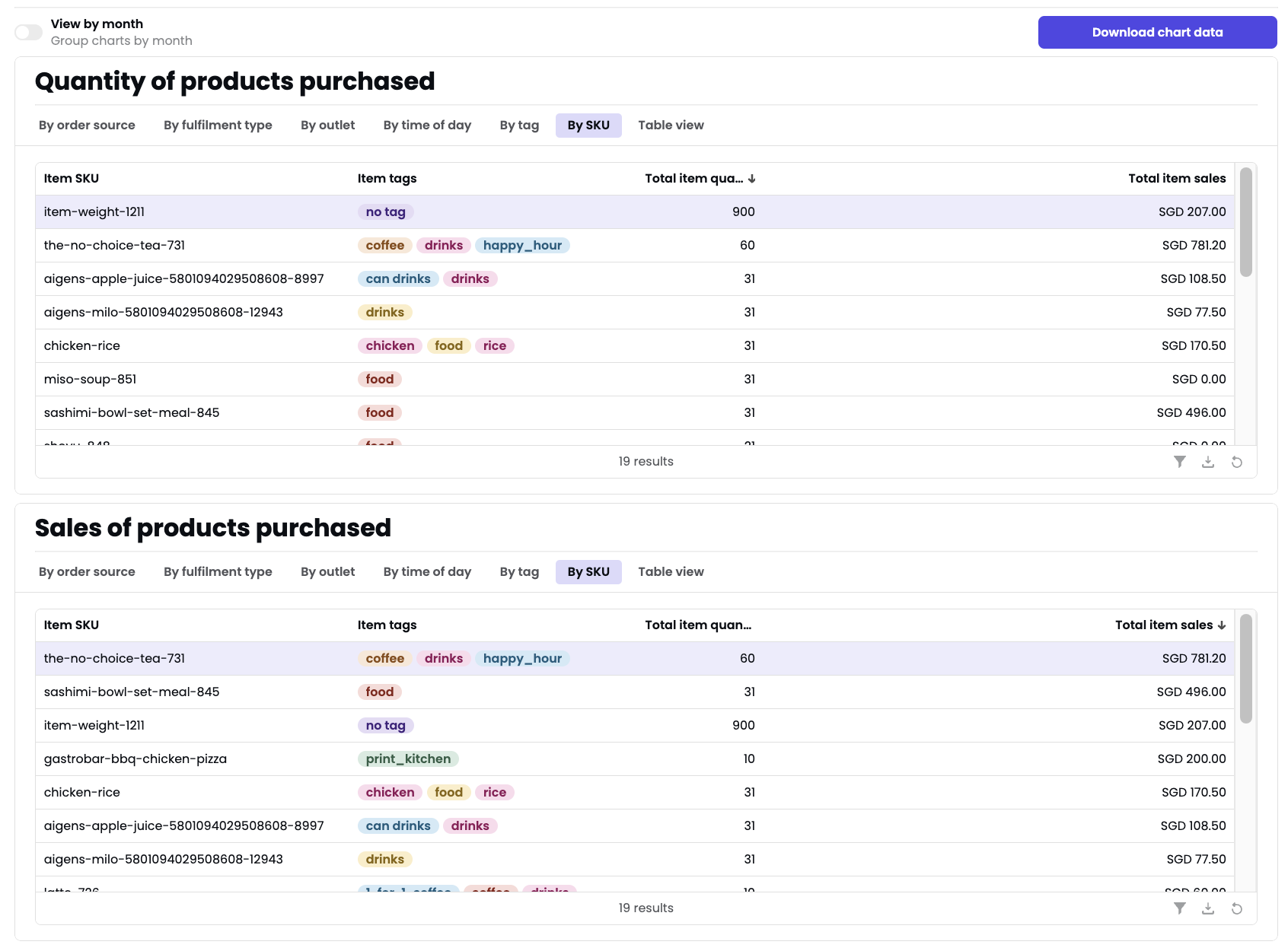
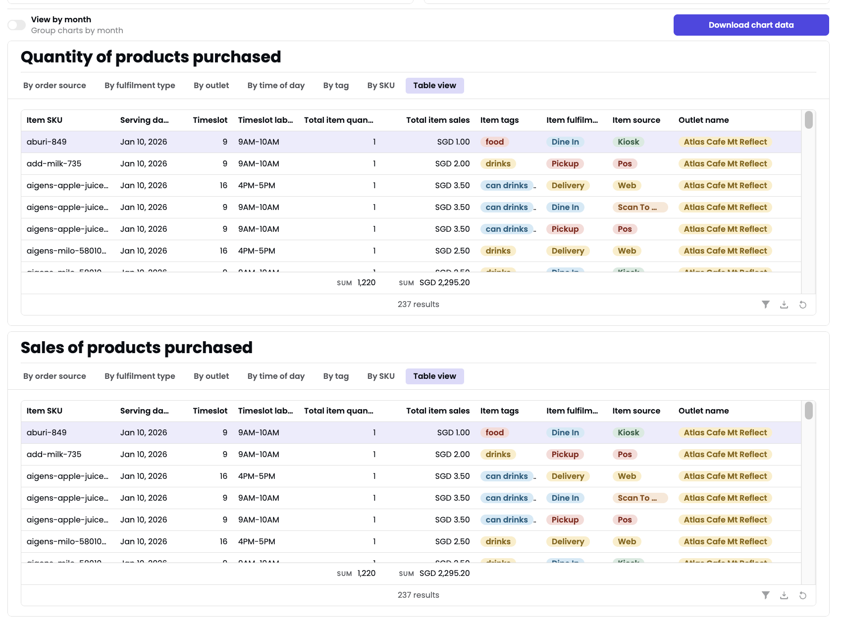
Quantity and sales charts
Two stacked bar charts show quantity and sales over time. Use the tabs to break down by different dimensions:- By order source
- By fulfilment type
- By outlet
- By time of day
- By tag
- By SKU
- Table view
Exporting
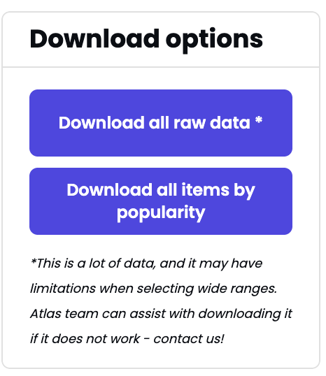
- Download all raw data — Full transaction-level export. May have limitations for wide date ranges.
- Download all items by popularity — Aggregated product list sorted by popularity.
- Download chart data — Export the current chart view.
For large date ranges, contact Atlas support if downloads fail.